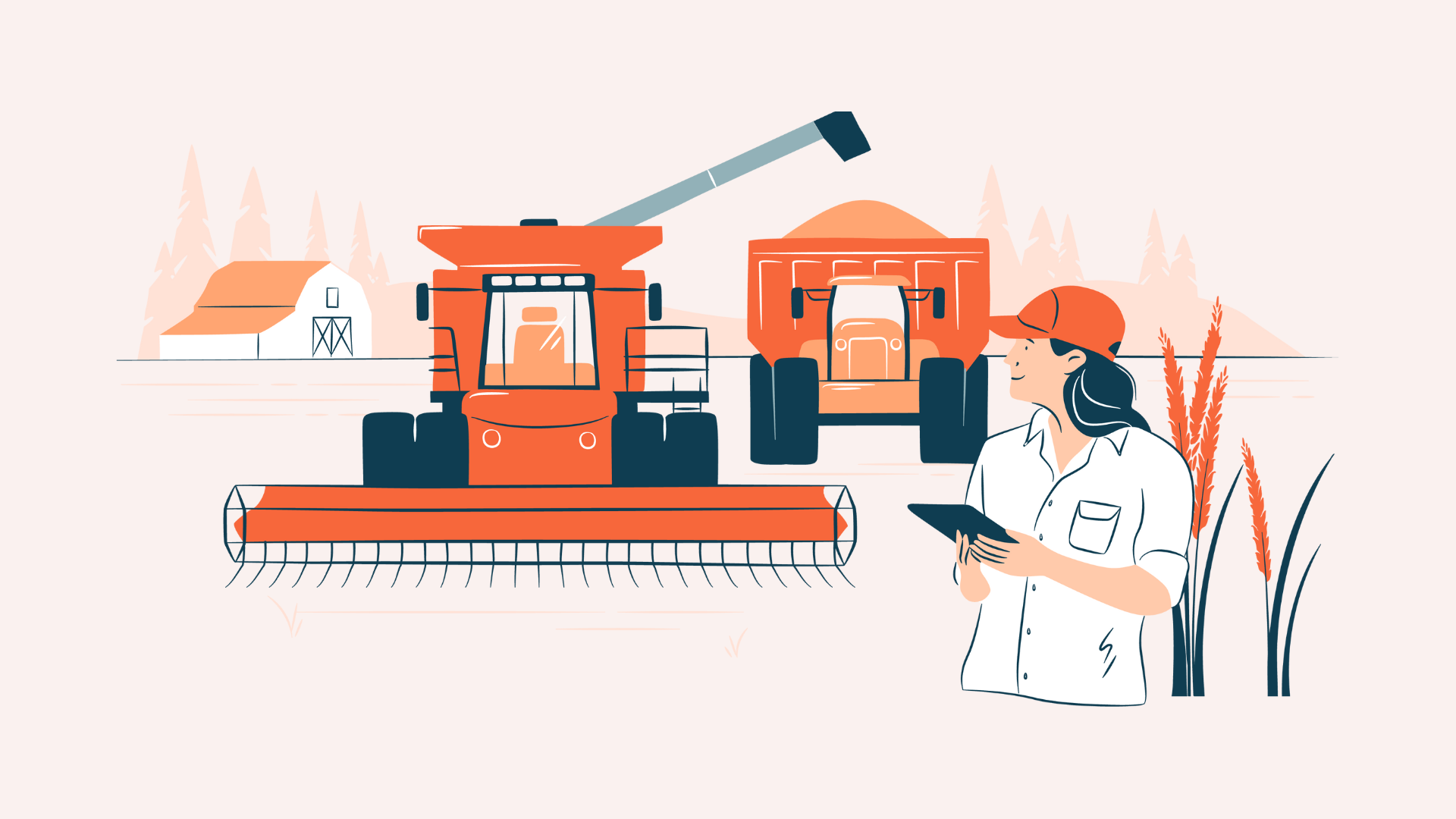
Dear friends, beware this is an ugly story with blood and guts of an innocent user experience designer called David.
Wireframes For the Win
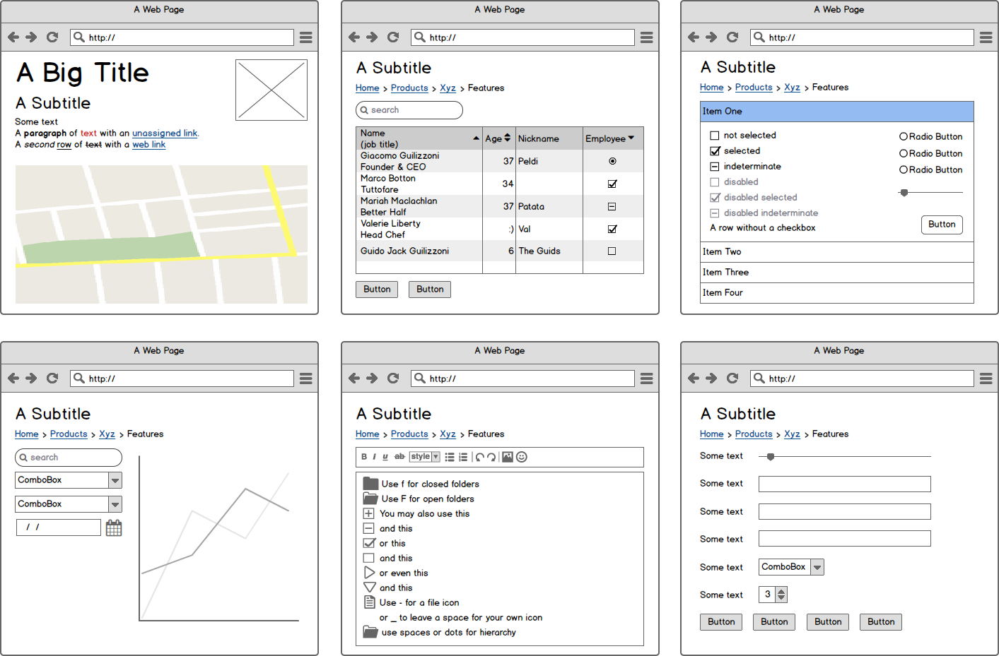
David’s LinkedIn profile says he’s ”an enthusiastic UX designer”. He’s just got his first assignment as a freelancer. The new assignment seems like no big deal – just a web site with six or so pages for a local company. However, after a bit of user research he realizes there’s quite a number of functionality required and there’s going to be some complex content and interactions involved. “No worries – I’ve got this covered! I just purchased new app for drawing wireframes. Badabing! I’ll use that to communicate with users, client and the development team later on.” David goes off to his home office, and starts carefully crafting required wireframes.
#1 The Mobile Madness
David feels good in the morning of the next client meeting. “I’ve got this nailed down! Everything my users need nicely organized in six views.” But the client has played this game before – the first thing he asks in the meeting is “how about the mobile users?” BOOM! David goes back to the drawing board.
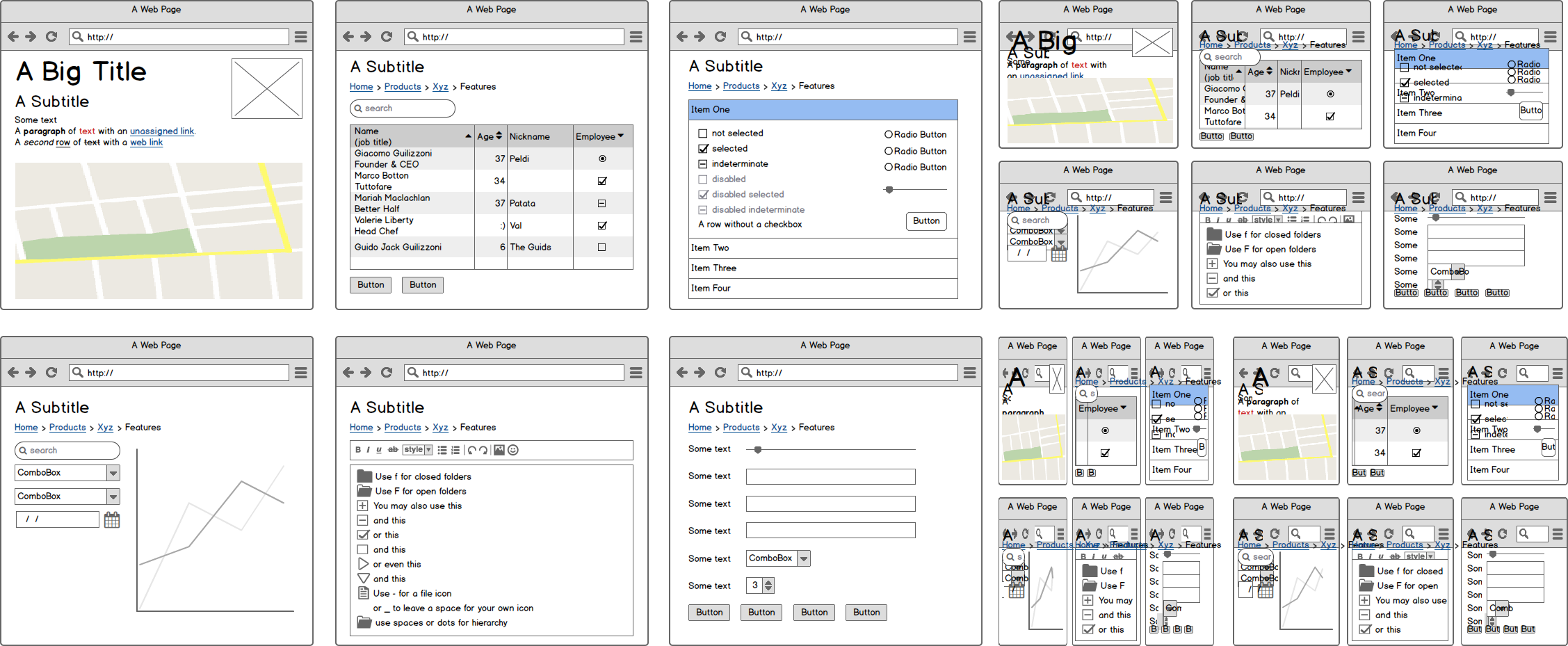
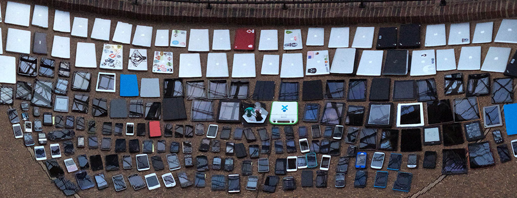
“Shit, how didn’t I think of this? I need to do the mobile designs too.” David does a bit of thinking, but doesn’t come up with any other way than to draw more wireframes to demonstrate all the mobile scenarios to the client and enable user testing. It seems he’s going to need views at least for mobile phones, tablets, and smaller and larger desktops. ”But what are the sizes for these?” David wonders. “There’s at least a gazillion devices out there.” David googles – and finds there are quite a few web designers asking the same thing in various web forums. David finds a relatively new nice looking blog post about the subject and decides the sizes are 480 px for mobile phones, 768 px tablets, 980 px for smaller and 1200 px for larger desktops. It all makes sense, right? David spends rest of the week working on his 24 wireframes. You see where this is going?
#2 Map is not the territory
Ok, what happens next? David goes to the next client meeting feeling confident things are ok now. But wait, what – there are some new people from various departments joining today’s meeting. And they open the Pandora’s box. “This content can’t be here. We need to add some new functions there.” And so on. David needs to spend another day or two updating these unexpected changes to his 24 wireframes. And this goes on and on, and finally four meetings later things start to look good – and expensive. Until on one weekend David’s 13-year old nephew, Lucas, comes to visit him. David shows proudly how his big assignment is progressing. Lucas stares at the designs, pokes his finger on a tablet wireframe and asks, ”how’s this supposed to work on my 7-inch Samsung Galaxy Tab 4? It has more pixels than your tablet drawing because I usually hold it with two hands in landscape position. But I would like to see these tablet things there and not this stupid desktop stuff like in this other “small desktop” drawing you have here.” David’s brains are about to explode.
#3 Visual Comp Mayhem
The weekend goes by and Monday morning comes too fast again. David’s phone rings. It’s his client. “Hi David, we liked your latest wireframes. The marketing department is asking what the site will really look like. Could you produce some visual designs by Friday?” David feels relieved – “I’ll start working on them right away.” David works day and night and creates some pretty nifty Illustrator designs. There are some new ideas he comes up with while designing, and he realizes the wireframes are starting to deteriorate to be useful for user testing. But David has no time to update them now. “Maybe I’ll just show these up-to-date visual designs to the users in the workshop next week.” He just doesn’t have time to update all the wireframes to produce a clickable prototype with his wireframe app. After two more client meetings David ends up updating all the visual designs twice. Meanwhile the development team has done some preliminary work preparing for the development, and they come up frowning – “We think there will be a lot of problems with your designs on real mobile devices. These designs can’t be implemented this way. Working more on your design deliverables is a waste of time. We need to start coding now. We just need to get this thing done.” Dang. Despite the set back, David collaborates with the team and rest of the project goes ok, and the site gets done. But still David feels something should have gone differently.
Couple of Beers Later
Before his next project David has done his homework. David thinks the problem was his static high-fidelity deliverables, which he polished much more than would have been necessary to communicate with the client and users. For his new project David is trying out a different approach – rough sketching and in-browser prototyping. Instead of designing static detailed snapshots of “pages”, he now starts with identifying real content and user interface building blocks. He makes quick thumbnail sketches and additional rough sketches to build joint vision with the client. Then he goes on into building a responsive in-browser prototype to test with the users. He’s no coder, but he has learned some basic HTML and CSS to start with. He’s also exploring some prototyping tools to help him out. If David goes crazy he might even use some JavaScript later on. Now he’s able to demonstrate from the very start how things really look and behave on actual devices. David needs to make changes only to one place in his prototype code and immediately demonstrate the effect on any device possible. He can introduce visual design into prototype and again show the results on actual devices to set the client’s expectations right. No more “I still need to copy this same bloody change into my 20 wireframes and visual comps”.
“Dude, we need those damn pixels! You need to give us some figures!”
Natives are getting restless. What about those pixels? Hell yeah – you need some breakpoints. But not breakpoints defined beforehand, but breakpoints that you find yourself as you work from plain content listing to larger displays. When your content starts looking ugly it’s time for a breakpoint – and most likely it’s not any particular device or device category width.
P.S.
And for those besserwissers out there – yes, you will still have well justified uses for wireframe apps and visual design deliverables with Photoshop and Illustrator. The world is not black and white. But don’t default to those tools just because “you are used to”, “you can’t” or “they expect you to” – they are not reasons, they are excuses. User experience design is not at its best use if time is spent to decorate static wireframes or visual layouts. They should be only means for discussion, not the end result. In-browser responsive design helps in discussing the important stuff – not focusing on the details of static deliverables.
Be aware when it’s time to stop polishing. Being lean and using maybe a bit sketchy deliverables may feel scary, if you fear they make you look “unprofessional”. But you should not fear, Lean UX will soon become your team’s best friend. Lean UX allows frequent design-build-validate cycles and thus ensures great results for your clients and users.
Try new things – you might find golden nuggets laying around right outside your box.