My suggestion is that we just stop talking about “user-centered design” for good, and resume to only use the term ”design”, when talking about the process of designing services and systems. You might be rolling your eyes hard now, so let me explain myself further.
What is user-centered design?
The term ”user-centered design” and its definition was born in the information technology industry in 1986, when Norman and Draper released their book called ”User-Centered System Design: New Perspectives on Human-Computer Interaction”. But of course, user-centric ideology had been alive even before that, especially in the industrial design world, where for example Henry Dreyfuss (1904-1972) paved the way with his classic tabletop rotary telephone for Western Electric, and his upright vacuum cleaner for Hoover.
By its heart, or how we have defined it in the later years, user-centered design means the iterative design process, which has basically the same steps that many other iterative development frameworks nowadays – for example the double diamond used in service design. In the double diamond’s first side we take a deep dive into the users and the use context, do enough of user research to discover the true user needs. Then we form some type of a solution to this design challenge, prototype and test it and if needed, go back to the drawing board. For Henry Dreyfuss, “user-centered design” meant designing products for the people to enjoy using. He talked a lot about the connection point between user and the product – which we could nowadays reference as “the user interface” in IT.
Designer vs. user
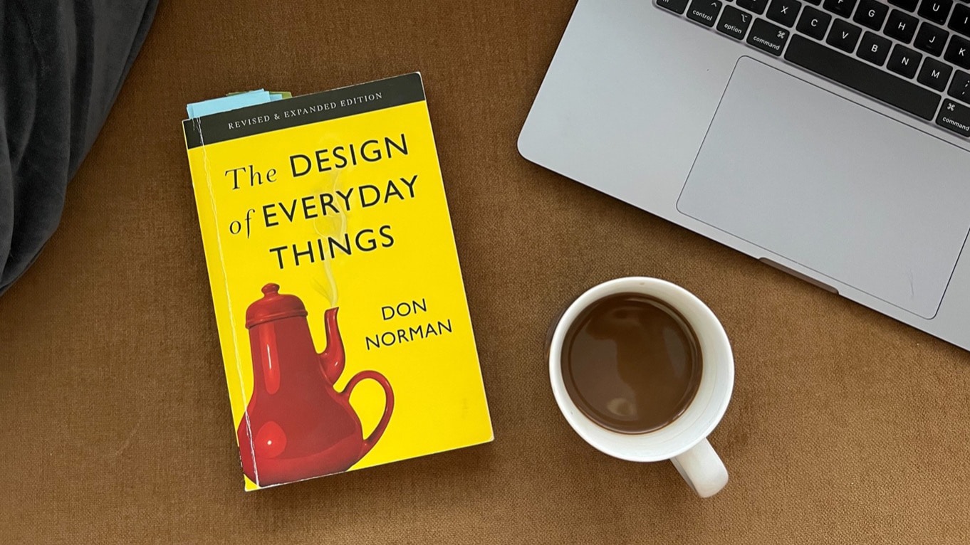
The joy of user-centered design was continued, when Norman later released his book called ”The Design of Everyday Things” (1988). In his mind one of the key things in designer’s role is to make systems, products, or services intuitive and interactive enough. He firmly stated that in his mind user-driven errors don’t even exist, but only bad design. Even though users tend to always blame themselves when any problems arise, which is also a fascinating phenomenon.
But I am very much on board with Norman, his business partner Nielsen – who you also may know very well from the usability heuristics studies – and all the other great designers before me. In the end, everything we design is for someone to use, the user. And what is the weakest link in all of this? I’m confident enough to say that it’s not the technology, but the user and the essence and constraints of human cognition.
Human cognition is the key
When designing anything from software to services and tools, your user will most likely always be a human with their unique brains. And as humans we have so much processing going on in our minds, starting with our thoughts, memories, and senses. And this all-mental action is called cognition. It refers to all processes that are needed to learn and use current knowledge and how we use our attention and perceive the world around us. Cognitive science as a research field has studied for decades the incredible power of human processing, and even tried to mimic that in machines, trying to create artificial intelligence. But that has proven to be tricky, as we know at this point.
Nielsen, the usability king with his usability heuristics and groundbreaking UX research, created a phenomenon called “Jakob’s law” – named after himself, of course. Jakob’s law, “users prefer your site to work the same way as all the other sites they already know”, refers to the basics of cognitive science – that we create mental models of our world, based on our previous experiences. How things have worked before, and how we think they should work now. This of course makes it easier to use systems and products when they feel familiar. But these mental models are not based on facts, but our understanding of the truth.
And why this and all of what cognitive science represents is so powerful in my mind, is the conclusion that there is no “one user” to refer to in design, but all the users and their unique way of understanding the world around them. How you see the interface for a system or a service, is most definitely not how others will see it, and that’s why we need to understand the people we are designing for.
And this makes design work so much harder, but also fulfilling.
There is no design without the user
So with this short deep dive into user experience and human cognition, I hope I got my point across. If user-centered design is a process, where we involve the user from the beginning until the very end of the process, what is design then? If we take the user-centered -prefix away, do we suddenly forget who we are designing for?
Yes, I do love exaggerations. But to me, a young millennial grown up with technology, it seems just absurd that we have ever even tried to design a system without involving the user. And yet somehow, we get news about patient care systems driving healthcare into crisis, and students losing sleep and graduation dates over a non-usable education information system.
We at Gofore are proud to say, that the principle we thrive for, is user centric. We are never designing just something our customer wants, but what is actually needed. Only from understanding the use context and the user, we can create impactful design. If that’s something you also feel passionate about, join our crew!


