With over 150 types of machines the GRIMME group offers by far the widest and most comprehensive product range in the area of potato, beet and vegetable technology. It is one of the global leaders in the area of potato technology. While developing the ‘VENTOR’, a completely new four-row self-propelled potato harvester, its user interface was to be redesigned.
Grimme
Unified operating sequence and good transparency shortened the training of drivers
With over 150 types of machines the GRIMME group offers by far the widest and most comprehensive product range in the area of potato, beet and vegetable technology. It is one of the global leaders in the area of potato technology. While developing the ‘VENTOR’, a completely new four-row self-propelled potato harvester, its user interface was to be redesigned.
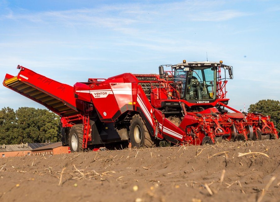
Unified operating sequence and good transparency shortened the training of drivers
Challenges in user interface and experience design:
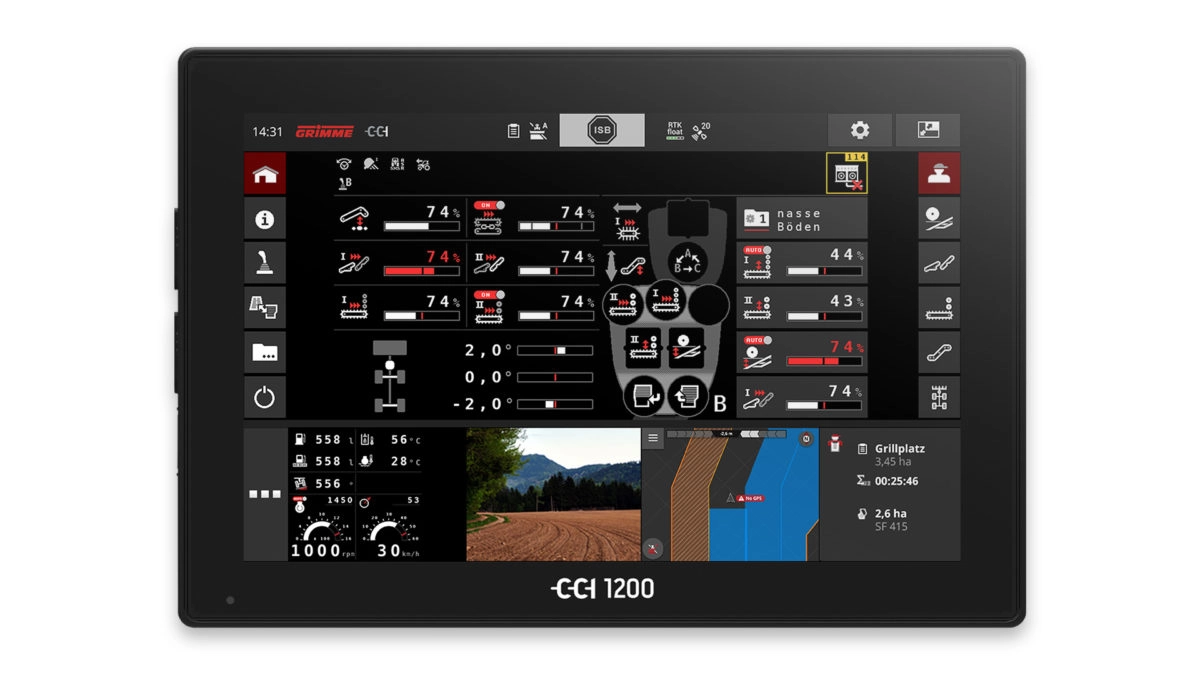
This user concept needed to be adaptable to the complete product range and flexible enough to allow product options to be build up in a modular fashion. As the vehicle controls of the existing machines had been developed over many years, they had become far too complex. So we first of all conducted an analysis and looked into which functions were the most important. For the first time the new CCI Touchscreen terminal made it possible to display high resolution graphics and view several stages of work at the same time.
- Design of an human machine interface (HMI) that applies to all vehicles
- Visual design and icon development, animations
- Style guide for future development and design of additional functions and machines
Solutions:
The aim of this project was to create a unified operating sequence and good transparency shortening the training of less proficient drivers and enabling them to apply once learned skills onto any type of vehicle:
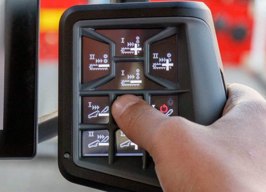
- The soft keys which serve as navigation switches between individual functional groups are arranged according to the product flow through the machine
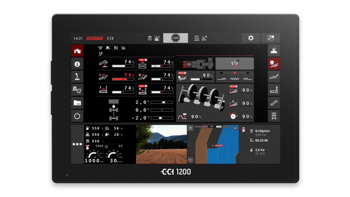
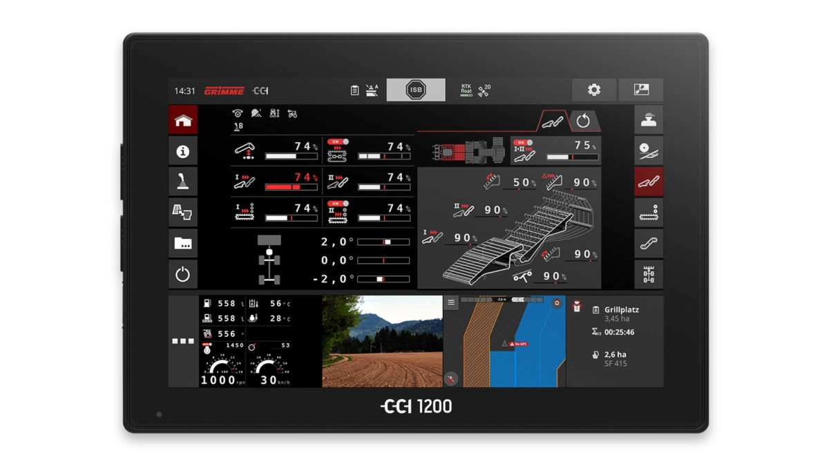
- Set-up assistants facilitate configurations and lead safely through complex operation sequences. These are sensibly combined and projected through large-scale illustrations.
- We developed a high contrast and unadorned icon style to meet the requirements of the job site with strong light reflections and large vibrations. The brand colour red was used as an accent colour.
- The data is displayed in a larger font and is particularly easy to read.
- Adjustment processes are clearly visualised with the use of animation.
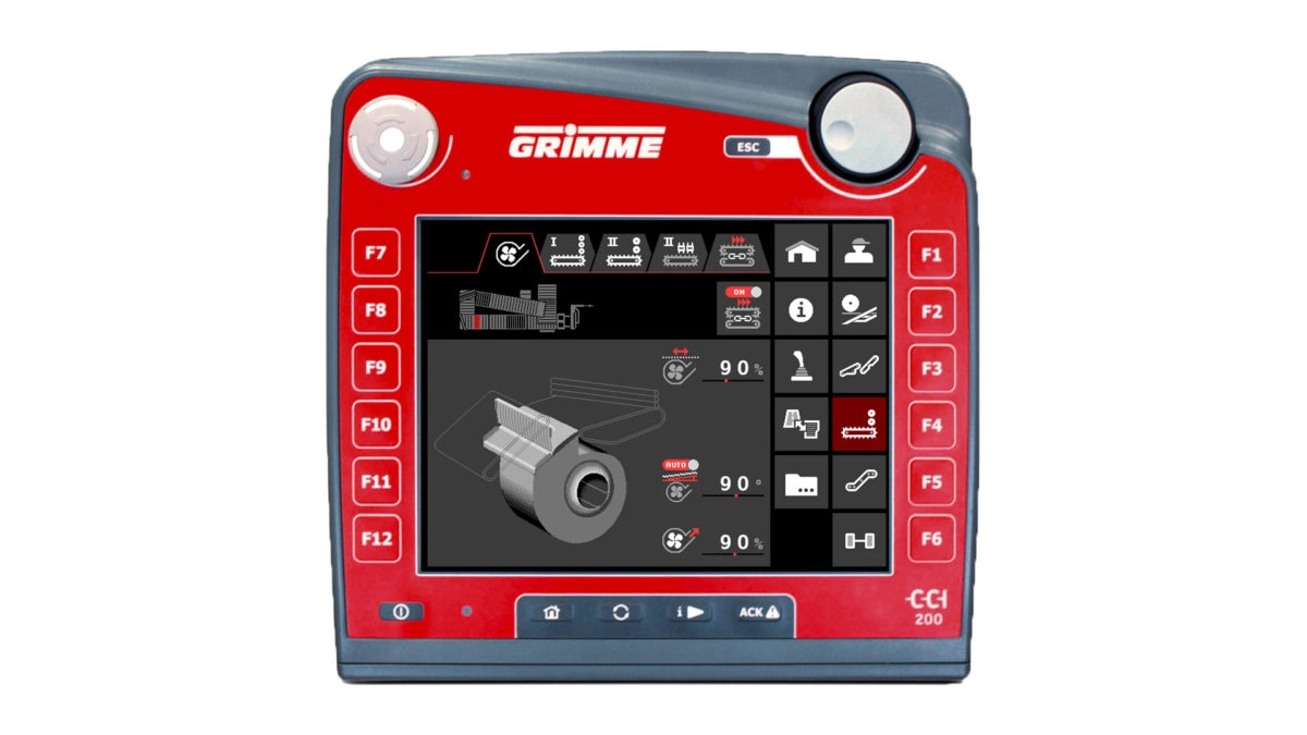
- Vehicle overviews & 3D illustrations provide information as to where functions are located and what they effect.
This new interface can also be used on existing Isobus terminals like the CCI 200 without losing functionality or quality. All graphics provide a high resolution in their bitmap format.
Highlights
Flexible design
Designing an adaptable user concept
Practical design
Simplifying complex user interface
Visualised experience
Creating icons, 3D illustrations and clear animations to visualise functions and effects
Expertise
The skills & competences utilised in the project
- Experience design
