
At the beginning of November, a group of Gofore designers and developers working in various design system projects gathered together to share their experiences. Participants from four different projects shared their experiences on tools they use, best practices, and other things they have learned along the way.
In this blog post, we’ll take a closer look at the tools used for designing, developing, and documenting design systems.
Design tools
Design systems usually provide some kind of design library or style guide for UI/UX designers working on product features and user flows. The chosen for producing this design library must of course align with the tools used by the designers.
Design and collaboration tools used in Gofore Design system projects
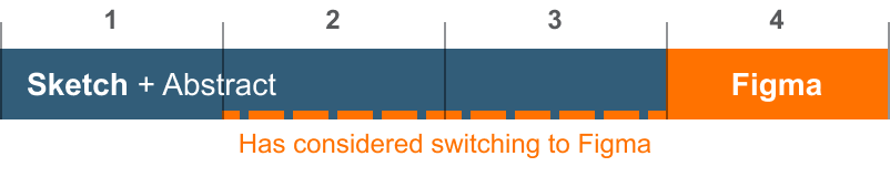
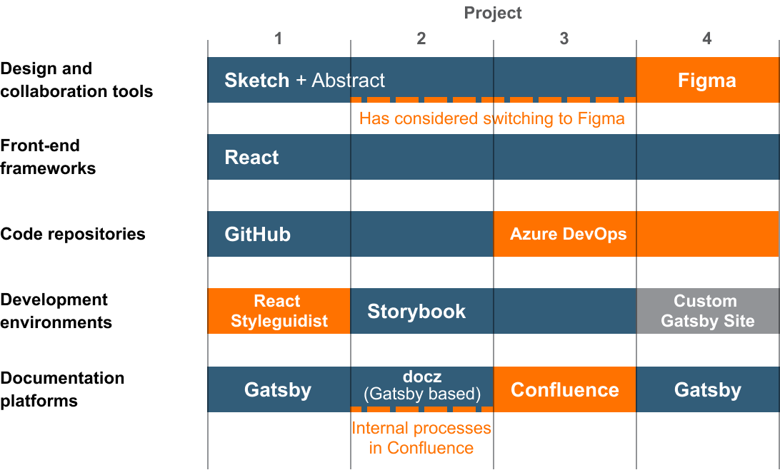
It is not surprising that three out of the four Gofore design system projects that shared their experiences use Sketch. When Sketch was first released in 2010 it was considered the game-changer in the user interface design field, and since then it has established a position as an industry standard. Sketch has a solid ecosystem of plugins that help to expand its core features and automate tasks. However, in recent years Sketch’s dominance has been contested by new tools with fresh ideas.
Sketch’s main competitor Figma has raised interest in the design community with its all-in-one approach, emphasis on collaboration, designer-developer handoff and design system-oriented features. Also, the way Figma’s handles styles is more flexible and the layout behaves a bit more like HTML box model than Sketch’s – something you might expect from a tool that is purpose-built for designing user interfaces. While Sketch is MacOS only, Figma is web-based, and also provides a desktop app for both Mac and Windows.
One of the alternatives for Sketch is Adobe XD. For now, XD is generally not considered to be a prime choice for design systems, but since Adobe has a stronghold virtually all other design tools, it can’t be counted out of the competition yet.
All in all, there are strong signs that Figma is already undermining Sketch’s dominance on the market. Even though all of the four design systems have initially used Sketch, two of the teams have at least considered the prospect of switching to Figma and one has already made the switch – and the switch has reportedly made the consistency of user interfaces better.
Design collaboration and versioning
One of the main reasons why Figma has made a foothold on the market is its emphasis on easy collaboration.
True collaborative workflow with Sketch can still be a bit cumbersome, even though Sketch launched their own browser-based file sharing and collaboration tool Sketch Cloud at the beginning of 2020. Its functionalities are still fairly basic – for example, the file inspector tool is still in beta – but it is definitely a step in the right direction.
So far Sketch’s shortcomings in basic collaboration features have usually been patched with Abstract – a separate design library tool that pairs with Sketch through a plugin. It brings a git-like version control and branch-based workflow for designers and enables reviewing, commenting, and inspecting design files. Abstract also helps to share library files with product teams, making it a prime tool for design systems. Like Sketch, its desktop app is available only on Mac, but it also provides a web-based interface.
Although Abstract is a great tool that has fundamentally changed the way designers can work together, it doesn’t always play nice with its counterpart. The fact that the whole collaboration workflow depends on two separate tools made by different companies, makes it more vulnerable to compatibility problems. From this perspective, Sketch’s strategy to expand its core features with plugins turns from its best feature to be a burden. This is the pain point Figma aims to solve with its built-in collaboration and communication features.
Figma does not support git-like branching workflow like Abstract, but the Professional plan offers an unlimited version history and sharing design system libraries for the team. The pricier Organisation plan also offers really promising design system analytics tools for measuring design system adoption and usage. This is hard to accomplish with Abstract, which only allows inspecting library dependencies file by file.
Time will tell how Sketch Cloud will develop and can it even Sketch’s odds in the competition with Figma.
Development tools and frameworks
Providing reusable and customisable components for developers is the basis of all design systems. Like design tools, the technologies design system components are built on is dictated by the technologies used in the actual products.
Front-end frameworks used
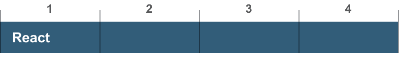
Among front-end-frameworks, the winner is clear: all four of the design systems are built with React.
Third-party libraries like Styled components are also commonly utilised to make component development easier and faster, and to help for example tackle tricky functionality and accessibility issues. However, even though these libraries can bring short-term benefits and time savings, most design systems tend to aim to keep dependencies to a minimum to avoid problems rising when the system grows more complex. Building design system quality components – especially accessible ones from the ground up is more time-consuming, but when the design system starts to grow in scale, managing dependencies can start to weight down the process and bring with them unexpected issues.
Code repositories and development environments
Quite often organisations identify the need for design systems when product development has already been ongoing for a while. Product teams have already established development workflows and environments and a design system is developed as part of these existing environments to bring consistency and reduce redundancy in development work.
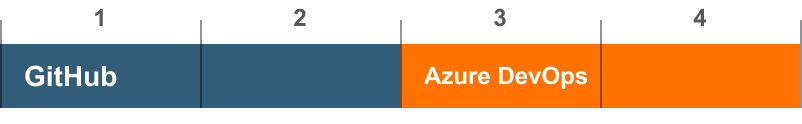
In the tools used for versioning and distributing design system repositories projects are two-fold. Two of the projects use GitHub. Both of them have shared their design system open source, so Github is an easy solution for code collaboration. Two of the projects use Azure DevOps, a part of Microsoft Azure cloud computing services which provides more comprehensive toolkit for DevOps and project management.
Other alternatives are for example GitLab and Bitbucket. All these tools are based on Git, but they all offer different DevOps tools for CI/CD, testing, project management, etc.
Component development / catalog platforms used
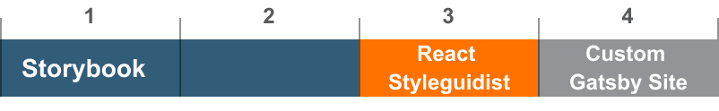
Most design systems also use development environment tools like Storybook and React Styleguidist. How these tools are utilised in the workflow vary between projects. Usually, they are used as a platform for developing and testing UI components, and as a component catalog for developers showcasing components and their functionalities, and documenting available properties.
Documentation platforms
Without documentation providing principles and guidelines for using the building blocks both in design and code, the design system is only a pile of components without a clear purpose.
The best tool for a design system’s documentation needs depends mainly on who should have access, and who should be able to add content to it.
 Documentation platforms used
Many design systems maintain a public documentation website – especially open source systems. Even if the actual components and design assets are kept private, a public documentation site can act as a marketing tool showcasing the organisations design approach.
Three out of the four design systems had a custom made public documentation site – all built on the open source static site builder Gatsby or some more documentation site specific variation powered by it, for example docz. Other open source alternatives are for example Docusaurus and and Cupper, both advertising themselves to provide good accessibility – which docz has some serious issues with.
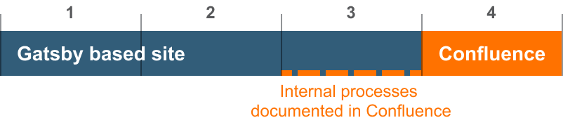
If the design systems is private and used within a single organisation, the documentation can also be managed in the organisations internal workspace like Confluence. One of the four projects used confluence for the entire documentation, one only for keeping record of design system related processes that didn’t belong to the main documentation site.
Both approaches have their pros and cons. A custom site gives the team free hands to build the documentation as they see fit: embed live demos and component playgrounds to documentation, automate token listings etc. But compared to Confluence, Gatsby site needs more work to set up and maintain. It also demands at least basic coding skills from content editors, since documentation is written in markdown and occasionally HTML or React. And, like any dependencies, the site builder can also become a burden. Gatsby in it self is popular and well maintained, but for example docz is not supported anymore, so it has many open issues that have been left without fixes.
The benefit of keeping documentation on an internal platform is that it is easy to set up and maintain, and it’s easy even for non developers to add content. But Confluence is not exactly made for this kind of use, and its features can become limiting. For example it does not provide many possibilities for automating, integrations or live component demos and playgrounds, so more documentation work has to be done by hand.
For this reason, the choice of documentation tool is surprisingly important one. Up-to-date documentation is crucial for the success of the design system, and If documentation is too laborious to produce it can become stale, loose its purpose and make the whole design system a dud.
Consequently, new documentation platforms have started to emerge on the market. Services like Zeroheight and Frontify aim to combine the flexibility of custom built documentation sites with the ease of content edition of workspace platforms. They also provide powerful integration tools with common design and development tools. Zeroheight and Frontify don’t come free, but can help saving considerable amounts of precious time and resources spent on documentation tasks and make the documentation more relevant and easier to digest for designers developers. Services like these, might well be the next big thing in the field of design systems.
Summary
Tools by project
The choice of tools can make or break a design system. Tools that do not fit the needs of designers, developers and other stakeholders can hinder the systems growth and adaptation. Tools are also constantly evolving, but changing tools along the way is tedious and should not be made based on trends only.
This is why the tooling of the systems should always be carefully considered right from the start, based on the needs of the products and teams it is built to serve.
Read also: The recipe for a successful Design System