Prelude
In digital times, people sometimes forget that the analog world still provides more organic results. Even though devices like the Ipad Pro + Procreate /w Apple Pencil and Wacom Cintiqs are getting closer and closer to analog results – analog still rules. It’s interesting to follow digital attempts on watercolour, oil painting, paint splatter and smudging. They are close to analog but still not quite the same.
Analog vs. digital
When deciding on a workflow that is suitable for you, there are some key points to consider:
|
Digital
|
Analog
|
|
|---|---|---|
| Advantages |
|
|
| Disadvantages |
|
|
* = can be converted to digital rather easily nowadays, like for example with Adobe Capture or Scan + Adobe Illustrator Live Trace
** = Git or a WYSIWYG choice of your selection (note: if you have no idea what is version control, now it’s the best time learn it! https://en.wikipedia.org/wiki/Version_control)
*** = pen, paper, ink, brush, paint, markers, scissors, sponge, water, hands, dripping, tossing, smudging, printmaking, painting, cut-and-paste, ..etc.
**** = Eraser, white opaque colour, redoing, reworking, …etc.
Speed
Time equals money – so speed is essential.
The speed of creation is hard to compare. It really depends on the tools you are familiar with (and learn easily).
Consider creating an organic background both in digital and analog. The time spent on analog will always need additional time for digitization. Let’s take a closer look at this interesting topic.
Options for digitizing
Scanner + Trace in Adobe Illustrator (Desktop) – The Oldie
The internet is full of articles about this, read this for example https://www.lifewire.com/use-image-trace-in-adobe-illustrator-cc-2017-4125254
Basically, you scan your image and then trace it to vector (or use it as a raster version). Depending on the scanned original + your live trace skills you might end up with great results.
In the end, you will have a vector version. Some images are virtually impossible to vectorize. Line drawings are easy, for example, comics.
Adobe Capture (Mobile App) – Easy Vectorized Results
Okay, this is what I love. I literally do.
Adobe Capture is not a well-known app. It’s a free app by Adobe that allows you to digitize assets to Adobe Creative Cloud and then use them instantly on synced devices – WHOAAAH!
Adobe Capture has the following sections:
- Materials – Easy creation of 3D materials etc, based on image/photo
- Type – Recognise a typeface based on an image/photo
- Shapes – Scan any raster shape into a vector from an image/photo – Wait, REALLY?!!!!
- Colours – Take an image of anything and create a colour scheme – Huh!?
- Patterns – Create a pattern from an image/photo, similar to a kaleidoscope
- Brushes – Custom brushes from an image/photo
Instead of writing an extensive tutorial on the app, check this video by Adobe:
For a free app, it truly delivers something extraordinary. I use this app weekly with comic creation and similar tasks. Just take a photo in the analog world and use it instantly on digital as a vector – this is as good as it gets.
Examples & Conclusions
There ain’t exactly one do-it-all workflow for creating visual designs and drawings. A true master needs to understand the context and the end result. Each end-media has its own limitations that need to be taken into account when planning a workflow.
Example 1: Praise IRL Label – digital + analog
When I was working on the Gofore Praise IRL label, I ended up mixing raster and vector graphics. (Gofore Praise IRL is one of our own Gofore beers)
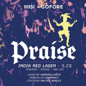
I have done print designs in the past, so I knew that I could make a raster graphics background by tossing paints in the analog world on a paper and scan the result. I just needed to be sure that the scanned end-result would have enough resolution (at least 300 DPI for the printed label). I post-processed the background in Photoshop and then placed it to an Adobe InDesign document, which was all vector on the other hand. TLDR: In the end result you cannot notice that the background image is not vector as well. It just looks all good, if you have enough DPI.
Example 2: Craig Thompson’s workflow for comics
Craig Thompson is a famous do-it-all comic artist, who has released awesome graphic novels such as Habibi and autobiographical love-story called Blankets. A direct excerpt from his blog says:
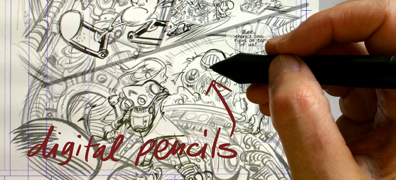
[ I ] settled on a compromise common among comics pros – I pencil the pages digitally [ using a Cintiq ], then print out blue lines and ink on actual paper.
The advantage of digital penciling is I can see a chapter all at once (top right photo), cut&paste, zoom in close, edit on the fly, and work standing up (top left photo, avec Momo). But digital inking still looks too slick to me — I prefer the flawed & tangible qualities of fussy sable brushes on paper. Foot in both worlds!
This kind of unique combination comes from the perfect understanding of his own medium and workflow.
Conclusion
To achieve the best results, you will need to:
- Understand your medium and it’s nuances
- Understand the optimal workflow for you (time spent, skillset,…)
- Understand the differences in vector/raster outputs
- Understand your audience (what kind of looks do they like)
- Benchmark other artists