
It takes tremendous effort to design something that feels effortless and pure. But does your team have what it takes to get rid of the extra weight to get there?
It works – so why isn’t it selling?
Many solutions that we use on a daily basis are examples of good design. The ergonomics of your coffee pot, the non-slip coating of your toothbrush. The social media app that you browse on your phone, and the bot sending you a reminder about that thing. Our every day is surrounded by good design, but we’re rarely conscious of it. We’ve become accustomed to it, and we know to expect it. Good design has become a commodity.
The thing with design is that when it’s good, it becomes invisible. A good design gets the job done but that alone doesn’t get you ahead of the game; the leading manufacturer of rubber boots doesn’t compete with the fact that they keep their customers’ feet dry.
When you’re browsing for flights for your next vacation, you’re thinking about your previous experiences. The check-in. How the staff greeted you. The taste of the coffee. The leg room. The WiFi. You’re not buying the solution to get from A to B, but the experience as a whole. You don’t buy the thing you need, you buy the thing you want.
If you want your product to stand out, you’ll have to design for the experience. Thie key moments that make up the whole story.
It’s as if they’re not even trying
When watching the Olympic games, you see athletes reach 8 meters in the long jump, throw a javelin for 85 meters and sprint 100 meters in under ten seconds. These people compete at the peak of human performance, but you can’t help but wonder how easy it looks for them. It seems to come to them so naturally as if they’re not even trying that hard.
But the athletes know that being the best means stripping the task all the way down to its molecular level and cutting out everything that doesn’t contribute to the goal. Only then can they start enhancing the tiniest details that can improve their performance. It takes everything to put all of the focus and energy into only those few moves, but it’s only those few moves make up the whole performance and bring them to the top. But to the viewer in front of the TV, there’s nothing but the few seconds that look easy.
The same effect is in action with design: the better the experience or the end-result, the less visible the effort behind it. The best design always appears as if there’s no effort to it at all. But that’s an illusion, too. In reality, “effortless” takes the most effort.
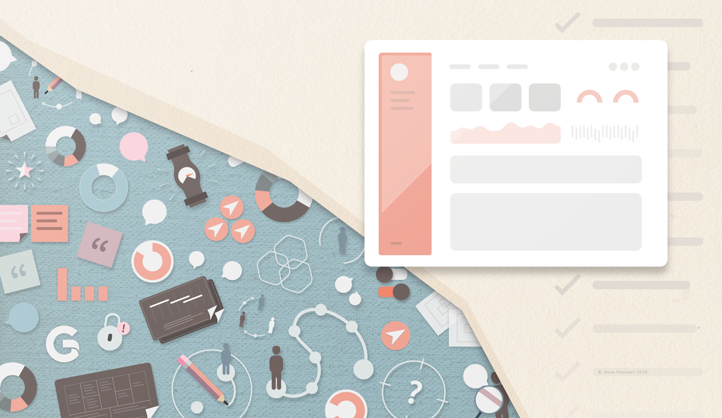
Google Search is an excellent example of this. So much is happening under the hood, but it only takes one input field and a button to deliver everything.

Effortless demands the most
Ideas might come easy, but no excellent design is ever created on a whim. It’s never luck. I’d say 80% of a designer’s work effort will never be directly seen, touched or heard by the user who buys or uses the finished product or service. That effort goes to identifying, questioning, explaining and deciding what the remaining 20% needs to focus on: finding out the right why to design for and getting to know the people who to design for, before even starting to think about the what.
Every thought, desire, and motivation researched, mapped, and prepared for. Every decision, contact, emotion, and action anticipated and accounted for. All with the aim to orchestrate a certain kind of experience that leaves a personal, emotional imprint. It’s this rigorous work done in the background that makes the final design feel effortless, sophisticated and pure. Because, as the user or the customer, you’re experiencing only those few key things that you’re meant to.
Your product needs a weight loss program
In 1955, Dieter Rams wrote his well-known ten commandments of good design. One of these commandments goes “good design is as little design as possible”. Times have changed, but the principle has never been more relevant. Today, we have so much that we want our users and customers to see and interact with that it’s never difficult to fill a screen with information, interactive elements, and a bunch of features. It’s an embarrassment of riches. You’re going to need to leave stuff out to make it better.
But I’m not talking about having fewer buttons in the user interface or using a more limited colour palette – I’m talking about checking the pulse before giving your thumbs-up for another year of life support.
What if the real problem has nothing to do with the user interface looking outdated?
What if the feature you’ve been working on so hard adds nothing to the experience?
What if instead of giving it a facelift you’d get rid of the whole thing?
Wait, why are we doing this again?
The question of why is a powerful tool. It forces people out of autopilot mode and dares them to look at the big picture again. Make the why into a habit in the project, and it becomes a knife that starts separating the fat from the meat. You start to see more of the core. The things that matter and have real value.
But the deeper you carve with the why, the harder the decisions become.
Making the decisions to focus only on those few things that matter the most, and doing just those superbly – that’s the hardest job there is. Bubbles will burst, and a lot of people will get uncomfortable. There will be compromises and disagreements. But being the best at one thing means not doing the other thing at all.
In design, the devil isn’t in the detail, but the things that aren’t there. It’s in the choices that aren’t offered, and the white space that doesn’t make people think. In the end, it’s often the absence of the things that defines the design.
The next time you face an excellent design, think of the things that aren’t there. Only then can you truly appreciate the things that are.