Know thy Context
In a designer utopia, the user is always performing one task at a time, i.e. performing a single use case in your product. Often times, the modern world consists of intertwined tasks and interruptions. This leads to a conclusion that understanding the use context is essential in order to carve great experiences.
Simultaneous tasks
Examples of what the user might do while she is using your mobile app product:
- Use other apps
- Have multiple tabs open
- Talk with other people
- Browse email
- Browse the world wide web
- Use other smartphone features
- Run
- Cycle
- Eat
- Listen to music
- Watch Netflix
- Do pushups
- …
In a nutshell: 100% of the user’s attention is not targeted to your product – it is divided among other interesting tasks. You don’t have full attention, so make your designs as if you were designing for an ape: Intuitive enough to be used with as little amount of attention as possible.
Feelings
The user may or may not have experienced something from the list within 1 hour of usage of your app.
- Run a marathon
- Quit a marathon
- Had a meal
- Eaten too much
- Slept 12 hours
- Haven’t slept for 24 hours
- Given birth
- Attended a funeral
- …
Emotions of a person are a cumulative result of a person’s past experiences. When experiencing your design, a user may already be frustrated by misfortunes experienced recently. On the other hand, she may be feeling like she is on top of the world.
But how to take this into account?
Learn the aspects of classical UI design. Read books, for example, Designing Interfaces: Patterns for Effective Interaction Design.
It’s all about compassion. Until we can deliver truly personal experiences, we should use polite but not too childish language in our user interfaces.
A frustrated person may also get angry with the experience if she has to wait for loading. You should avoid loading experiences or make them unnoticeable.
Take advantage of user personalisation on different platforms. For example, someone may prefer different font sizes on iOS. On the web, make things responsive, zoomable and bookmarkable.
Personas are the de facto way to put yourself in someone else’s shoes.

A persona is a way to model, summarize and communicate research about people who have been observed or researched in some way. A persona is depicted as a specific person but is not a real individual; rather, it is synthesized from observations of many people. Each persona represents a significant portion of people in the real world and enables the designer to focus on a manageable and memorable cast of characters, instead of focusing on thousands of individuals. Personas aid designers to create different designs for different kinds of people and to design for a specific somebody, rather than a generic everybody.
Get hands-on experience of the context
Acquire hands-on experience of the use context as much as possible. If you are designing an AR-based collision-detection system for an excavator, be sure you step into the control room and learn basic maneuvres with the actual excavator.
These kinds of experiences have many benefits, they:
- Help you gain empathy towards users
- Help you understand simultaneous tasks
- Make you go through the same emotions as the user
- Motivate you as a designer
- Give you unforgettable experiences while working (great!)
So now you are with real users – why not observe them at their work and hold a workshop on the same day? Get another designer to accompany you – alternate the roles of documenting and observing users during the day.
Go through the materials and extract the most important remarks. Make iterative designs
The Setting (Location, time of day and weather)
Alright, let’s come up with a totally imaginary situation and platform.
Imagine this context: 7 mountaineers are trying to reach the top of Kilimanjaro. A storm arises, the group is dispersed. John and Andy are with each other, but Andy has broken his ankle. Luckily John packs a weather-proof mountaineer smartwatch – there is an app installed that is supposed to have one mission: Work as a beacon for safety helicopters to save mountaineers in danger. This app will send a GPS signal for the rescue squad in the background and is only used in emergencies.
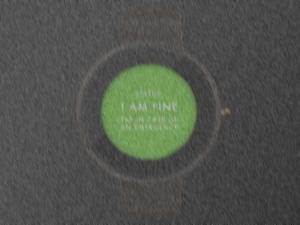
Now let’s make a quick 5-minute mockup in Sketch. Once you open the app on the watch, you will see this. The soothing green with text informing you that you are not in any danger (I know, red and green are a bad colour combination).

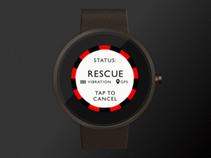
Once you tap the green screen, the view will go red and the text will change – Now a rescue squad is on the way.

Great… But wait, there is a snowstorm on Kilimanjaro, and the text vs. background contrast may not be enough in bad weather. Here’s how the landing view would look like in a bad storm:
Indeed, we need to improve the text legibility.
Here’s the second iteration with larger text size and more contrast (black on white with green circle)

Here’s the snowstorm simulated again:

Now compare the legibility in the “snowstorm” – We gained some contrast and legibility with our changes, great!
As the smartwatch is positioned on the mountaineer’s hand, he can always bring the watch closer to his eyes to gain extra legibility.
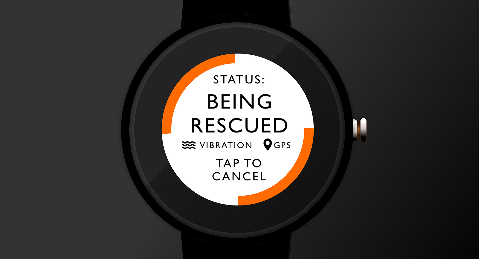
If I were to be rescued, I’d like to know that the rescue signal is still being sent (my battery hasn’t run out). I’d also like to know that the signal is being answered. Let’s improve the rescue mode too. (I’ve made the same legibility changes also to this screen).

I’ve decided to add a GPS signal icon to symbolize the rescue signal being sent. Also, I’ve added a vibration feature to the app, so the person who is being saved gets a vibration on his wrist for 60 seconds (or so, this should be user-tested) and is aware that this rescue mode is on. It is reassuring for the user to feel the vibration and trust that the rescue squad is on their way. A soothing beacon…
But how does the user know that help is on its way? We need a way for the rescue squad to signal back to the watch.
Let’s split the rescue mode into two views: pending vs. on-its-way views. Let’s make these statuses as obvious as we can, so the mountaineer doesn’t have to think too much while their life is on the line.
We can make use of the circular red + text to signal these two UI states.
Here are all three final versions
|
Rescue app opened
|
Rescue Pending
|
Rescue request received
|
|---|---|---|
|
|
|

|
…And the possible state transitions.
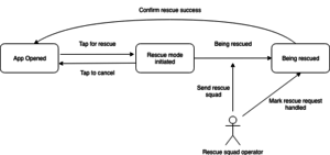
The rescue operator would need a client to handle rescue events, but let’s not design this. It would be likely a web/desktop application and the operator would use a phone on his daily work.
What we have learned
Design is affected by simultaneous tasks and user’s emotions. In order to put yourself in the end user’s shoes, you should get first-hand experience with the context by defining personas and putting yourself into user’s shoes. Design changes based on the setting (Location, time of day, weather).
In our example, we ended up making changes to the original design idea based on understanding the use context.
- Typography
- Interactions
- Animation
- Colours
- Haptic feedback
This was just a 30-minute example – more complex scenarios lead to more complex changes. What you need to do is iterate on the designs, and make end-user tests. Norman & Nielsen suggests that you only need to have 5 end-users to get saturated on end-user testing. Lean UX is a set of principles that rely on iterating the designs. Don’t forget to pivot if you need to!
To be continued – This was part 2 of a number of posts on the topic: “How to Prosper on Every Platform”.
Be sure to read part 1: Design Essentials: How to Prosper on Every Platform – Know thy Platform (Part 1)